




And You by Hellocean
posted by retail design blog on 2026-07-06
Add to collection
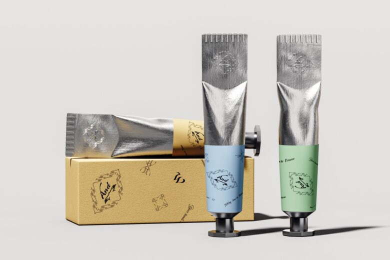
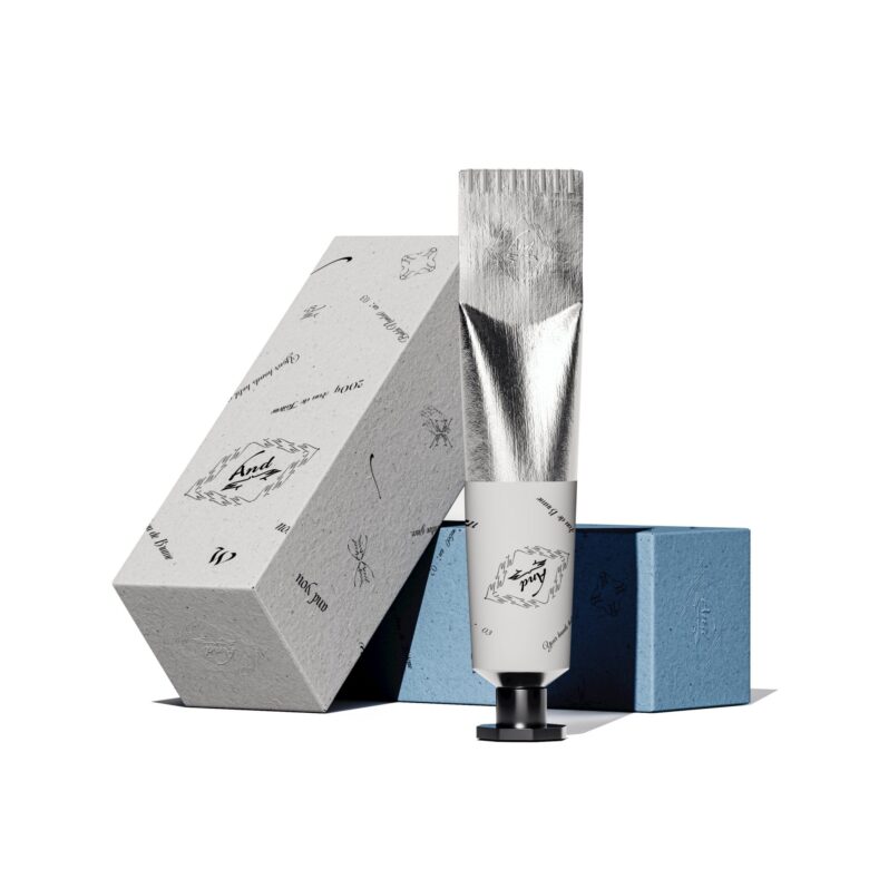
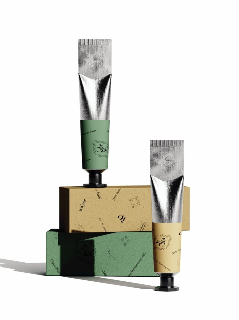
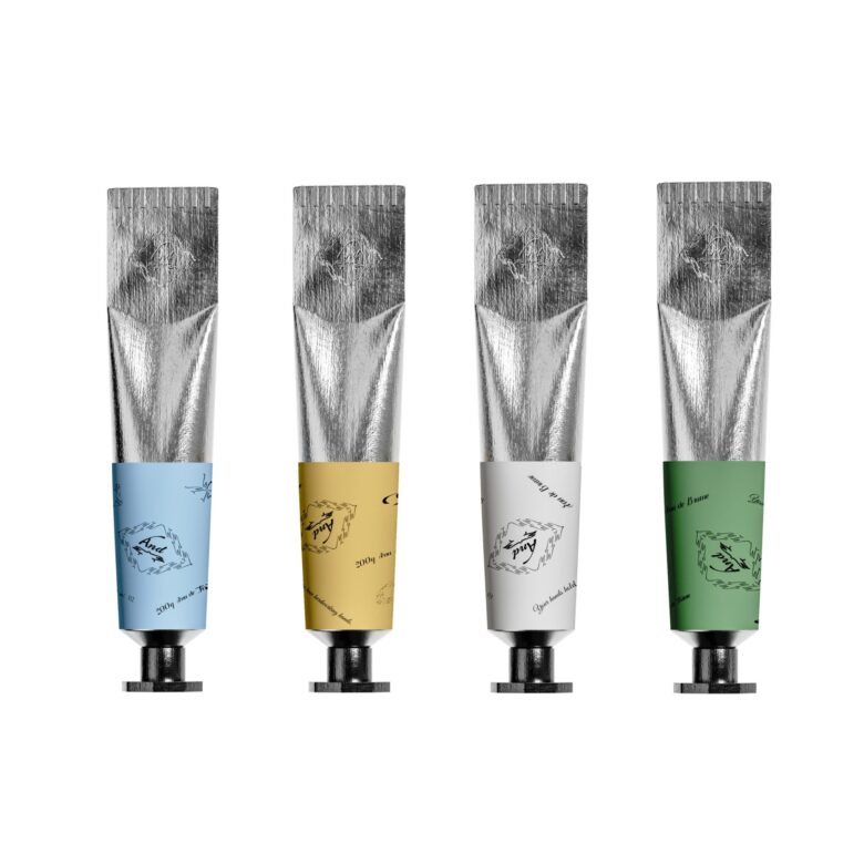
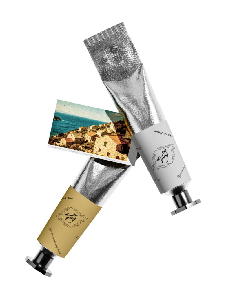
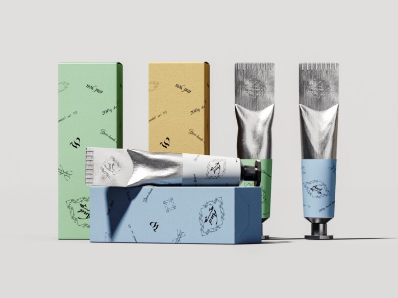
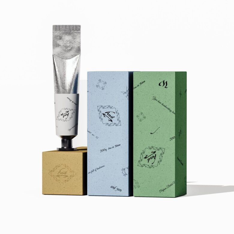
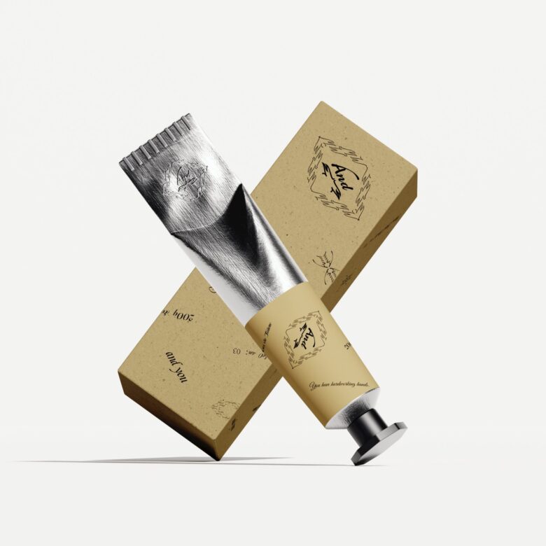
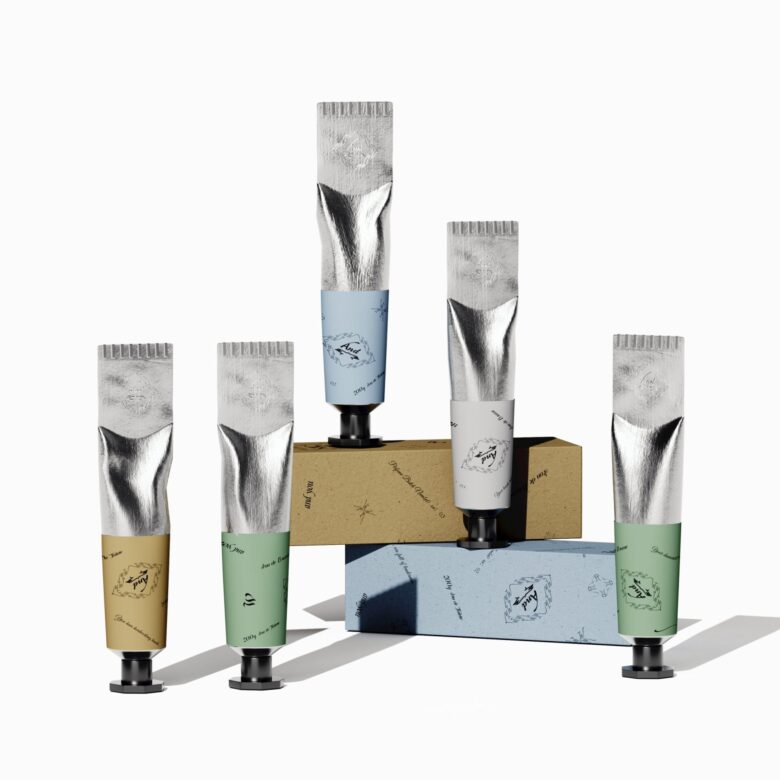
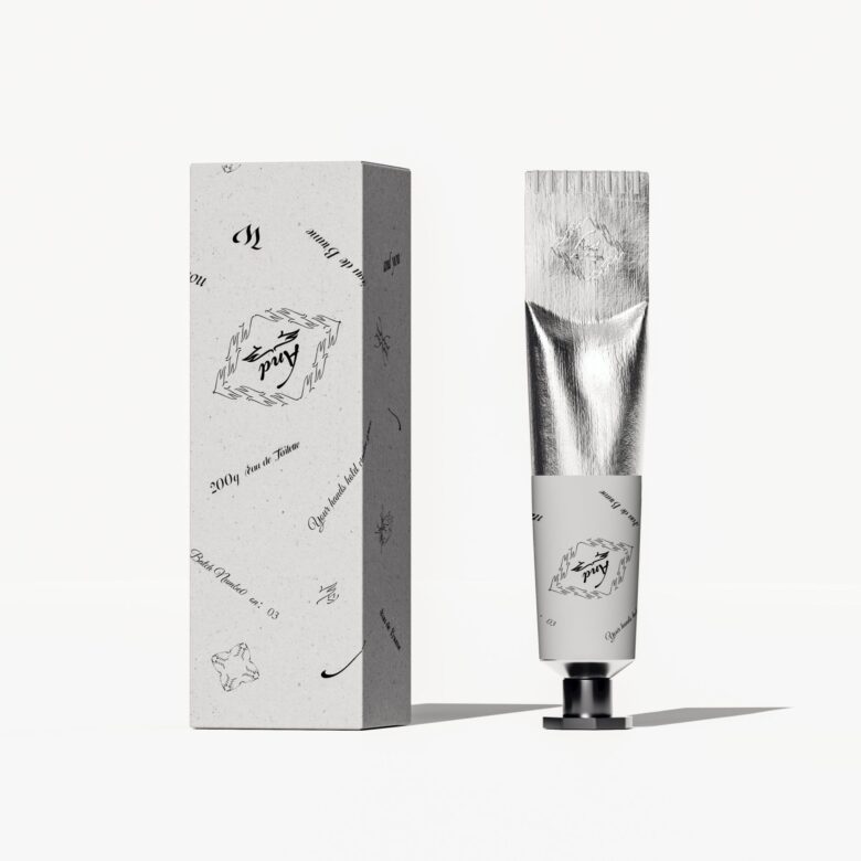
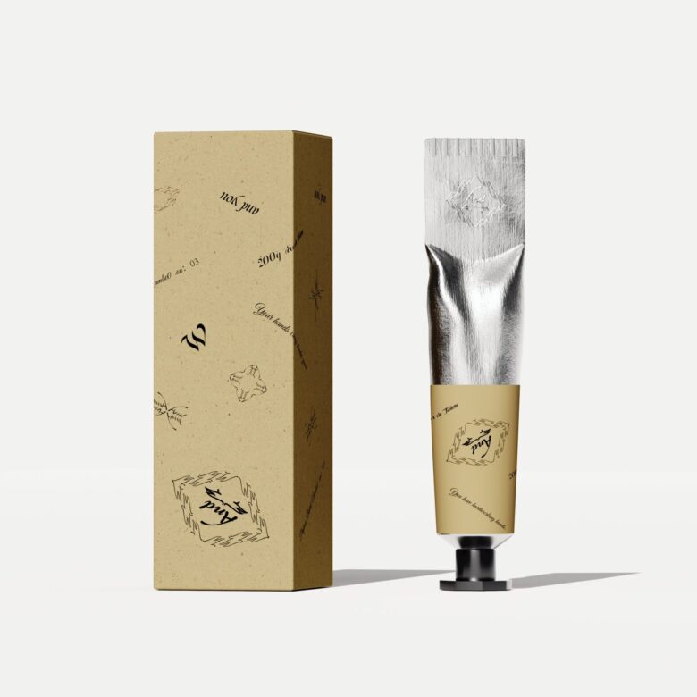
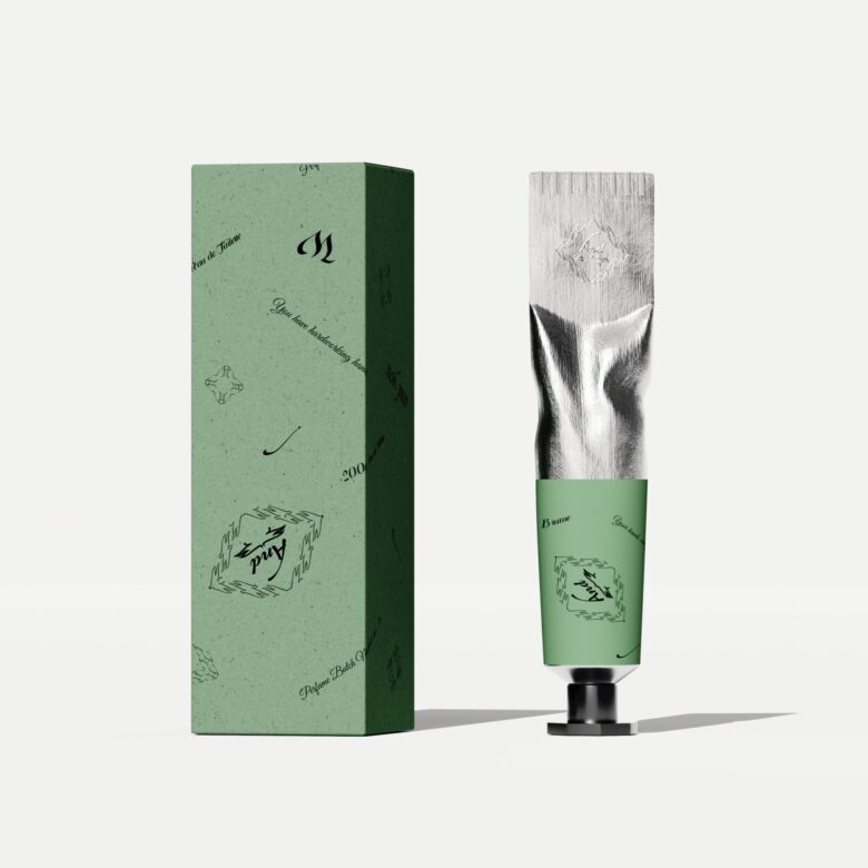
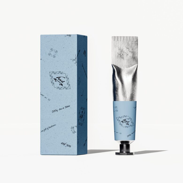
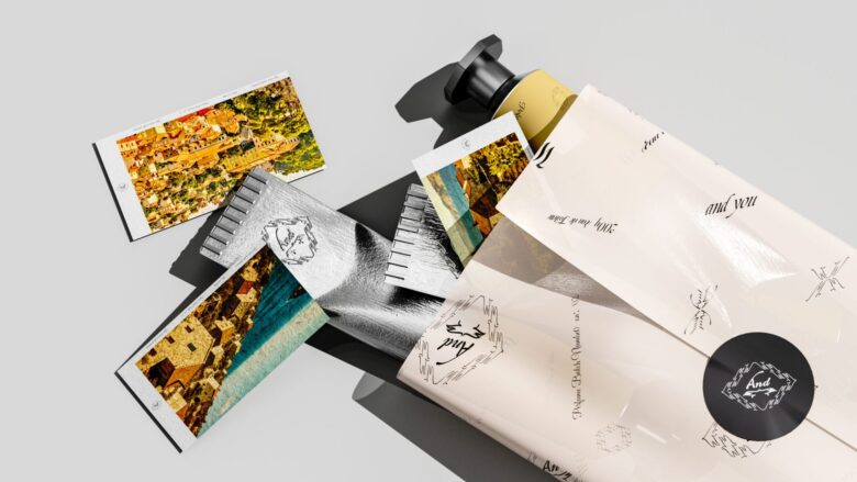
What stands out here is the category borrowing. The tube shape, the aluminum cap, the pedestal base: these are all cues lifted from fragrance packaging, not skincare. That choice does real work. It repositions a fairly utilitarian product, hand cream, as something with the same ritual weight as a scent you’d choose deliberately each morning.
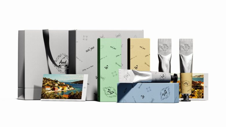
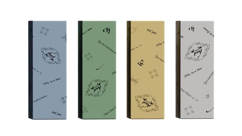
The pastel base colors keep the system from feeling too clinical or too luxury-coded, landing instead on something quieter and more personal. Pairing that with handwritten script, rather than a typeset logo, reinforces the sense that this is meant to feel individually considered rather than mass-produced, even though it clearly is.
The kraft and stone-colored outer boxes are the more understated move, but they matter. They hold the metallic tubes in check, so the collection reads as considered rather than showy. That restraint is probably the design’s most lasting contribution: proof that borrowing luxury cues doesn’t require borrowing luxury volume.
Add to collection