

Alida Sayer’s work is inspired by the world of illustrative and experimental typography and gives a different dimension to illustration and visual design. While working mainly in black and white, she adds colour to the way we view typographic elements into design.

When did your journey in the magical word of letters begin?
I began working with type only about a year ago, during the final stages of my Visual Communication Design degree at the Glasgow School of Art. I specialised in Illustration, enjoying the creative freedom that it allowed, but found it difficult to work according to narrative traditions and more experimental projects were often left unresolved. I discovered that typography provided the perfect formal framework from which to ‘hang’ my ideas. It allowed my imagination to run wild whilst still retaining a layer of universally recognisable information.
What was your initial source of inspiration?
I had been working with layered images for quite some time, but the introduction of typographic elements came later. I think it was a combination of sources that inspired me to pursue this route. Most significantly was my proper introduction to the letterpress, and the realisation of it’s immense potential for my own working methods. I enjoyed approaching a process so closely tied to the tradition of graphic design as someone with a more illustrative way of thinking. I was also very inspired by the somewhat coincidental and timely discovery of a world of illustrative and experimental typography whilst researching illustration and visual design in general. Most notably, however, was a London exhibition by Sam Winston and the work of Edwin Pickstone, a typographic designer also working in the case room at my art school. The intricacy and skill of their work is both staggering and beautiful.

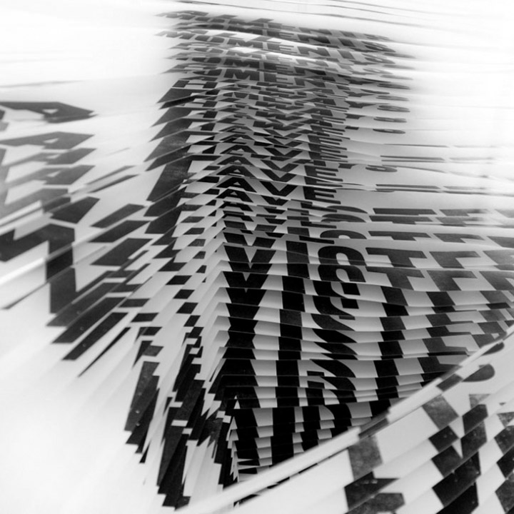
You chose Vonnegut’s novel “Slaughterhouse Five” as the book for your three-dimensional typographic pieces. What lies behind the selection of the specific book?
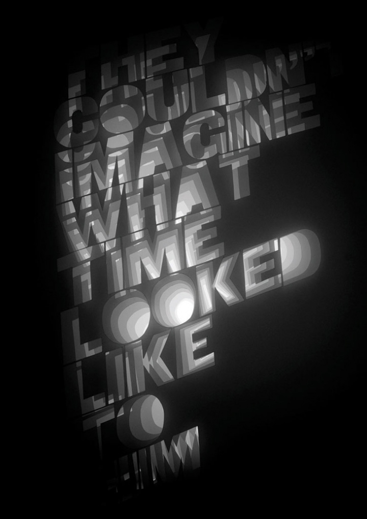
I read the book a year and a half ago and it really struck a chord with me. I was particularly inspired by the concept of an alien race conceived by the confused mind of the main character who is trying to come to terms with difficult memories. The alien race addressed various issues he felt with his past experiences by not only presenting to him alternative methods of considering time, but also oneself in relation to it, with richly visual descriptions. To me the challenge of “visualising time” this way or trying to communicate visually what it could be like to see the past, present and future all at once was a very exciting prospect.
I decided that by using creative typography and quotes from the book itself, this would ground my work in a recognisable form and allow me to be more experimental without becoming entirely removed from the original subject.
What means do you usually use in your work?
Much of my work begins as hand-drawn images or letter-pressed prints which I usually then scan and manipulate digitally. I also often work across several sheets of semi-transparent paper to plan out or structure work in order to create a relationship between layers of information. I also use a lot of paper cutting techniques, which I do by hand with a scalpel. The forms are created very much instinctively. Although I do have a general idea of how I want it to look, much of the layered cutting grows naturally with each piece informing the position of the next.

Any favorite designers that have influenced your work?
I am influenced by all manners of art, craft and design, but a few do spring to mind. Namely the complex hanging installation art work of Cornelia Parker, the music videos and charming hand-drawn animations of Michel Gondry, Stefan Sagmeister’s bizarre typography and the diverse range career of Thomas Heatherwick – whose christmas cards to my father were a source of annual inspiration and envy!

In a digital world we miss the beauty of a unique handwriting and are getting used to the various fonts in our computer. How do you feel about that?
The prevalence of mundane digital fonts is forcing designers to cast their nets wider in order to create typography with a unique voice. This includes experimenting with more unusual or ‘analogue’ materials and processes before re-incorporating them into a format suitable for dissemination across the rapidly advancing digital communications channels. I feel that this is a very exciting time for design, where traditional craft methods are not only being revisited but are also combined with complex digital processes in order to create truly innovative and astounding, yet still very tactile, work. The key to truly forward thinking design is to harness both the capabilities of digital technology and the important lessons we learn from traditional materials and processes and combine them using our own unique creative personality. Computers are tools to be used. They do not create beautiful design – people do.

Do you prefer experimenting more with black and white, color or both?
I have always tended to stick to a more monochrome colour palette, I suspect due to the influence of my photographer father who works predominantly using black and white film. I adore colour but often find it difficult to use in my own work. Perhaps it is because I always end up thinking about it far too much! I often find that the times when I use colour most effectively are those when it appears accidentally.

I was deeply impressed by the Suspiria project. How was this idea born?
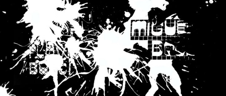
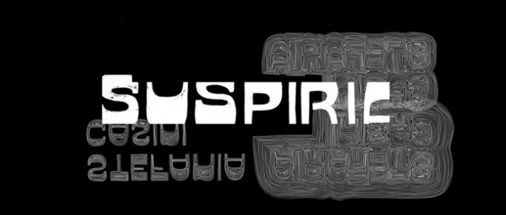
This project was inspired by the great tradition of the title sequence as a unique opportunity to combine typography and moving image. I was immediately drawn to the seductively visual SUSPIRIA (1972) – a cult Italian horror film directed by Dario Argento – with it’s dramatic lighting, variety of unusual camera angles, bold graphic interior backdrops and ethereal atmosphere. The original sequence was rather stark yet used an unusual, distinctively seventies style typeface which I kept as a form of template. I decided that through the manipulation of this type the sequence should gently reference events throughout the film without obviously divulging any of the major plotlines. I wanted to maintain a “flow” throughout the sequence but without too much repetition in order to maintain interest. This is why I began the storyboarding process with large continuous drawings, which I then divided into sections. The challenge was really in the transitions – to see how many different ways I could link one word to the next.
Please tell us a bit about your future projects and plans.
I fully intend to continue my exploration of typographic design, whether it be alone or as part of a studio, as I feel it is something that I am only just beginning to really get to grips with. I would love to make pieces on a much larger scale – so that they can become even more interactive, something you could walk right into!
http://yatzer.com/Yatzer-meets-Alida-Sayer


Add to collection
