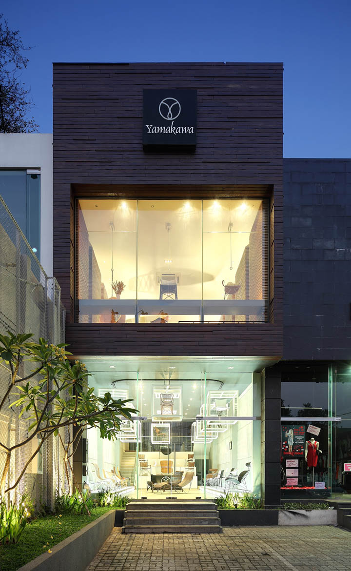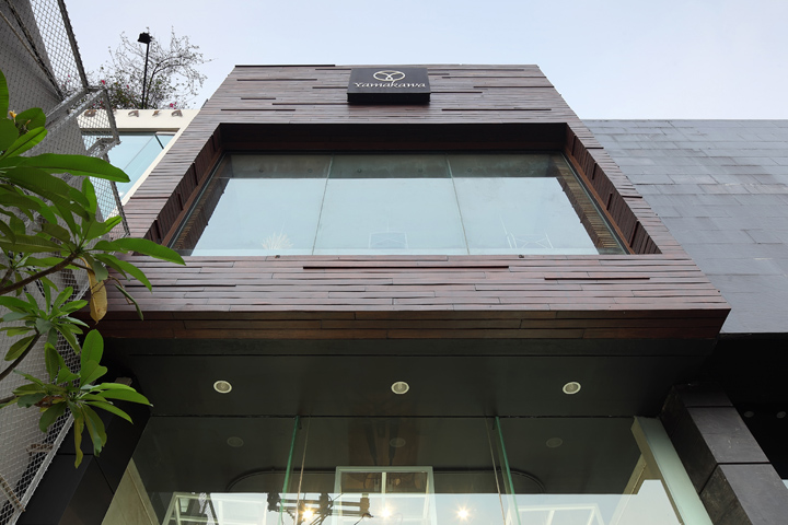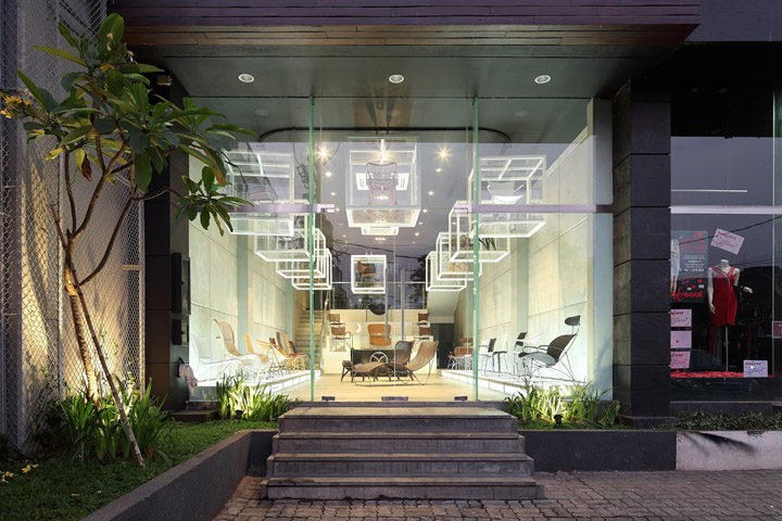
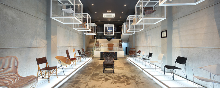

The main concept of the design of the YAMAKAWA Rattan showroom by Sidharta Architect is to let people experience the product in a different way. People from the street will see the façade of the building as a two storey mass with a hanging cubical on the first floor, and other products displayed behind frameless clear glass on the second floor.

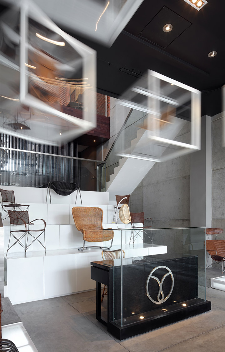
As you come into the first floor, the architect wanted to make it look like a gallery. The products become an artwork on an acrylic platform at the wall on both sides while we come into this level. We will also find the rotating acrylic box – white painted steel framed – hung by a conveyor system. This box will rotate in a set time, displaying any product which allows the visitor to look at it from several angles. So back when we see Yamakawa from the street outside, we’ll see the product display constanly changing on this rotated box.

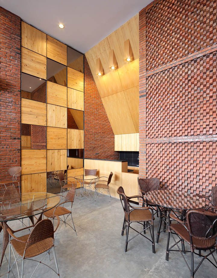
Behind the reception is the display stairs and it goes to the 2nd floor which is divided in two and you’ll pass the back office area and restroom in the mezzanine. At the second floor, you’ll experience the ambiance and layout to be more like a living room or dining room. In here, people can sit and try the product with a warm atmosphere in wooden touch at the wall side. The idea is to make all the products become the main attention and the interior to become more simple with an unfinished / natural-look on the material to highlight the products.

The third floor of this building is a food and beverage area displaying dining chairs and dining tables. In addition to the design of the floors, the architect used materials such as the cement floor, exposed brick, precast concrete and wood to deliver a pure atmosphere where the product becomes the main attention of this showroom.


http://www.archdaily.com/209072/yamakawa-rattan-showroom-sidharta-architect/
