Add to collection

Task: To create a brand that fit succinctly within the Patrón portfolio that represented craft in a new way. Scope: Naming, structural design, packaging design, brand architecture.
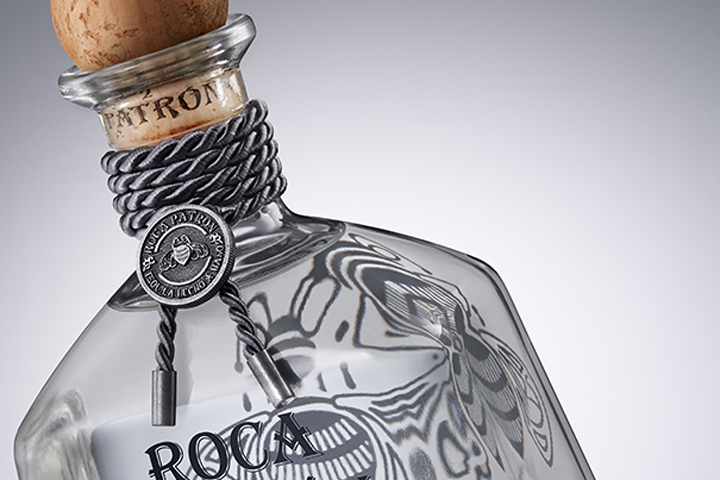
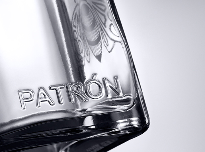
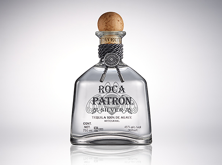
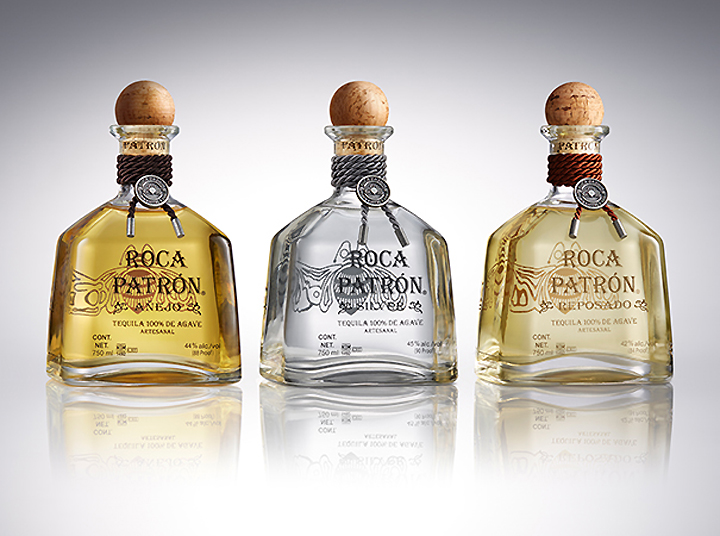
Solution: A premium new bottle structure that cues Patrón bottle but elevates it, using a heavier glass base, transparent body and angular shoulders. A rope and medallion rest on the neck of the bottle, signifying the traditional tahona process and labor used to make the spirit.
Design by Pearlfisher.
http://www.pearlfisher.com/designs/patron-packaging/


Add to collection