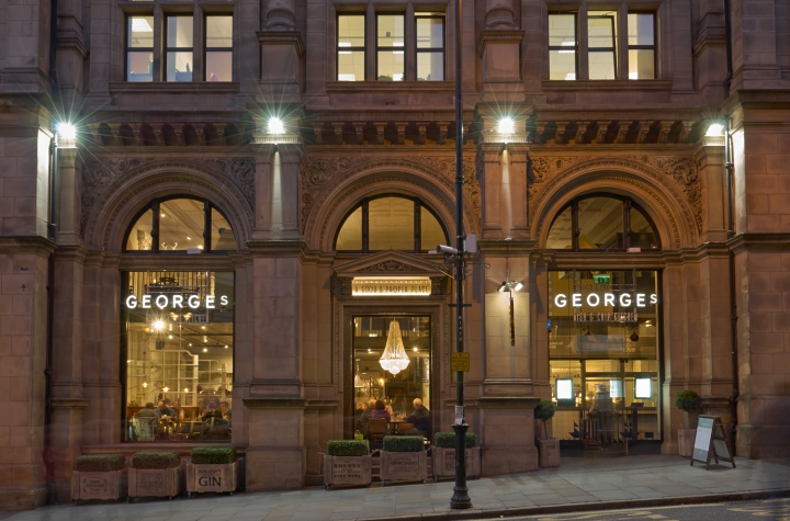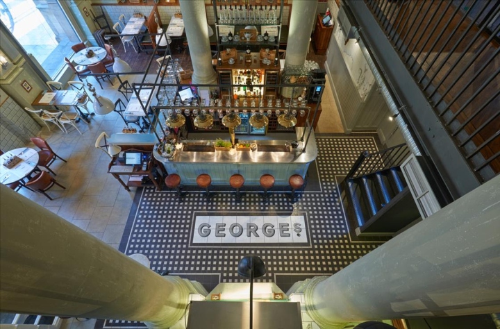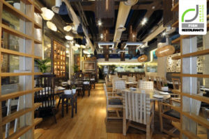

The English are serious about their fish and chips, and when George’s Tradition, a chain that promises “First Class Fish and Chips” planned to open a location on London’s luxury shopping road High Street, they tapped multidisciplinary design house Philip Watts Design to realize their new restaurant.

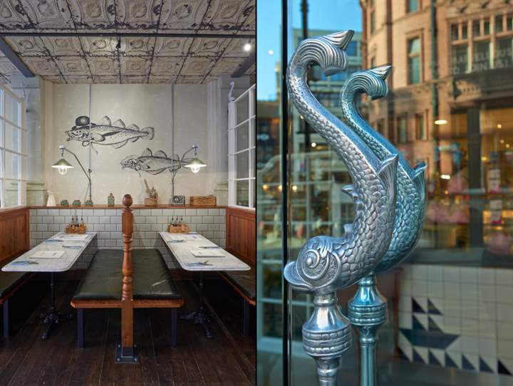
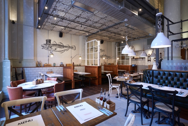
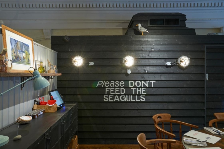
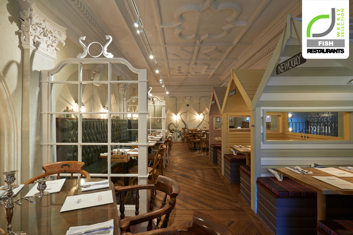
The High Street location builds off the character of George’s Tradition’s previous thirteen locations which began in 1967. The idealized small town fish shack look is up-scaled with added touches of whimsy and classic Victorian English sculptural elements, something that Philip Watts Design, which has their own custom lines of door handles, furniture, and more excell at. The design house did not only create the interior, but was asked to set the voice for the company by designing the packaging, graphics, and signage.

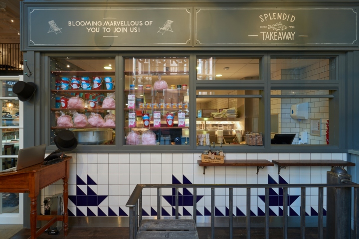
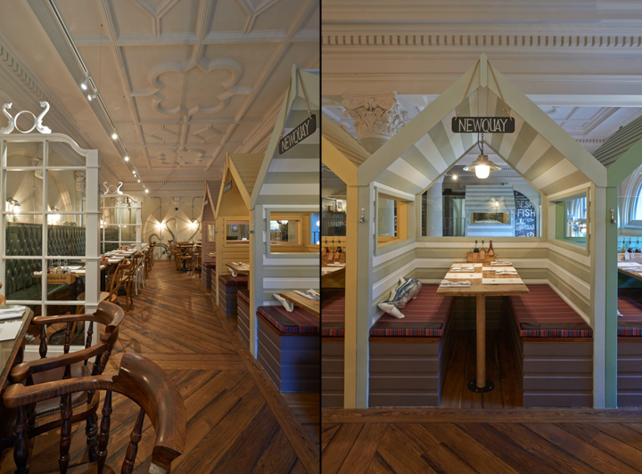
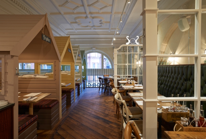
The two floor space with 120 covers features a ground floor storefront for take-away orders and a gin bar, while the upstairs kid-friendly space boasts a series of small beach huts where the fish and chips are served in buckets with a sand shovels.

“The most satisfying thing is it all works, the interior is in harmony with the offer, from eating your mushy pea fritter starter to polishing off your candy floss desert, the interior presents, entertains and has established the brand,” says Philip Watts of Philip Watts Design. The restaurant has been nominated for a Restaurant and Bar Design award 2015 in the category Best Interior Design Project or Product (leisure) and will find out if it wins October 1 of this year.


http://designlifenetwork.com/gone-fishn/
