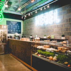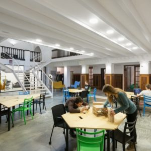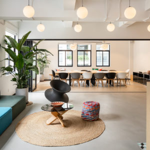
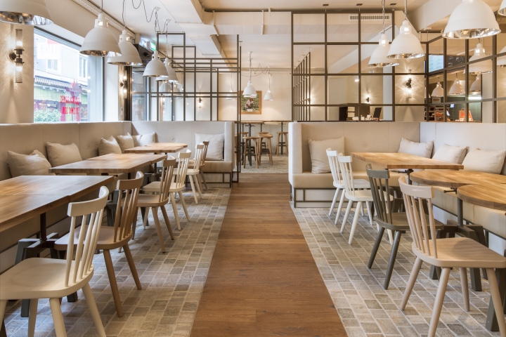

,Natural Taste ‚and‘ Food from Farmers‘ – this is the strapline of B. Good, an American burger-restaurant chain, which has opened in recent years, thirteen restaurants in the US. The first B. Good Restaurant in Switzerland (Langstraße in Zurich) was designed by the interior and branding agency DYER-SMITH FREY. The designer deliberately transfer the brand values of the burger chain welcoming and light: handmade, freshness, regionality and transparency.
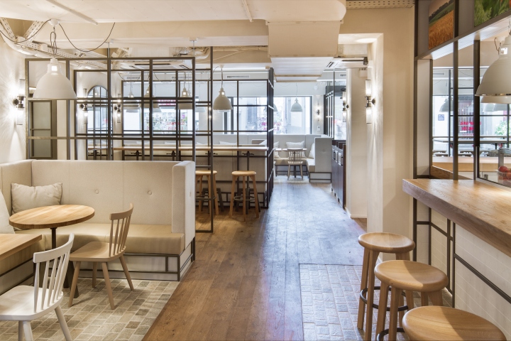
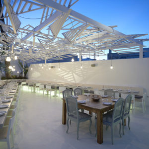
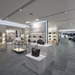
DYER-SMITH FREY focusses on natural materials like wood, stone, brass and marble. The color concept: lots of white, light grey and beige tones. Inspired by the country style of the Hamptons, the design duo has created an atmosphere that appeals homely, almost private. Still the decor holds back discreetly – the food is the star. The flooring of the restaurant is mainly light sandstone cobbles, especially in the bar and counter area, while natural, regional oak traces a path to the restaurant area. Dark gray, non-vitrified steel structures used to delimit the individual restaurant areas, without affecting the open approach of the interior design.
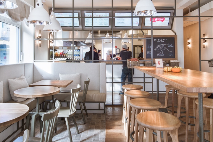
All furniture such as tables, chairs and stools are drafted by DYER-SMITH FREY and were made in regional joiners workshops. The light-colored upholstered benches with high backs and solid-colored pillows put soft accents. Inspired by a market stand, the counter made of white marble tiles and natural oak, separates the kitchen from the restaurant and provide the customer with enough room to order.
Photo credit: Idealcomm Patrick Armbruster


Add to collection
