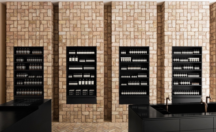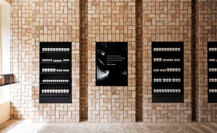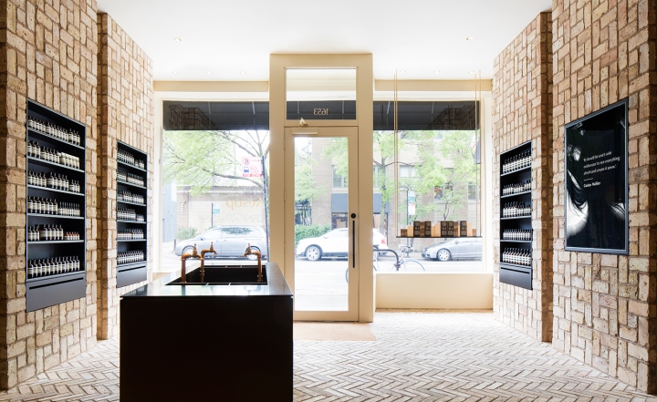
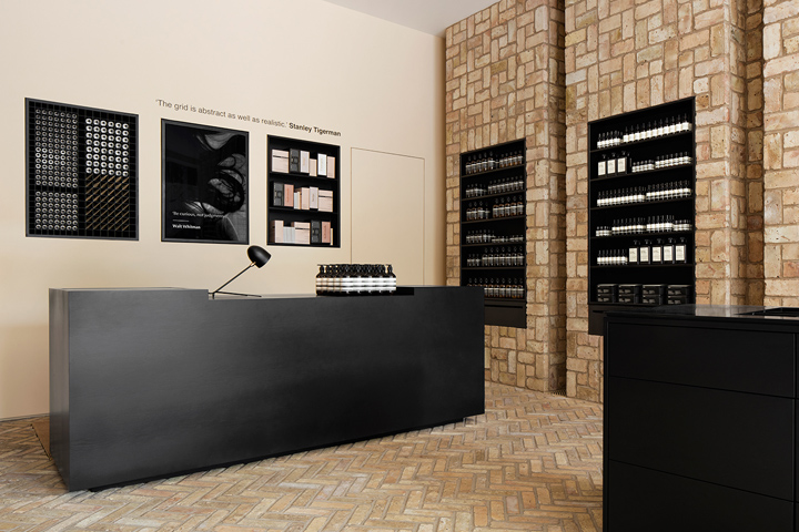

Aesop has been rolling out boutiques around the world with a fervor; but thankfully, each outpost continues to adhere to the carefully considered and well-designed ethos that the brand holds dear. Chicago’s newly opened Bucktown spot marks Aesop’s first entry into the American Midwest. Located on a busy corner of the stylish neighbourhood, the 1,000 sq ft shop pays special tribute to its Chicagan heritage. Designed by Norman Kelley, an architecture and design collaborative based between New York and Chicago, the space is built upon an architectural grid motif, made up of Chicago common bricks that have been reclaimed for use.

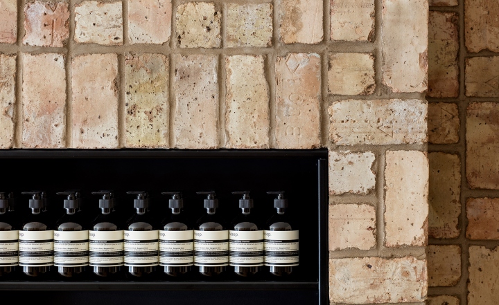
Age and size were some of the design challenges encountered, explain practice heads Carrie Norman and Thomas Kelley. ‘The space sits within a fairly common post-fire (1871) type of Chicago building known as a two-flat. We removed a non-functioning chimney to allow for an open plan and unobstructed view of and from the street. In addition, to carry the load of the bricks – approximately 10,000 [of them] – the existing floor was entirely restructured; new concrete and steel construction[s] fill the crawl space below. Imagine a structural diagram that reads like a Russian doll.’ These porous bricks, which have been arranged in herringbone and pinwheel brick bond patterns in the walls and flooring of the store, are a mainstay of local alley façades and regarded as an economical material.

‘As its name implies, the Chicago Common brick is both local and ever-present in the city. Owing to its low cost, high strength, irregular colouration and unequal dimensions (no two bricks are identical) it was the brick of choice for alley façades, [though] never street fronts, from 1871 through 1981, when it was last manufactured,’ the duo adds. ‘Historically, architects like Frank Lloyd Wright have been trying to elevate its ‘common’ rank by exposing it in unlikely places. We wish to add to this material history by packing the brick’s bespoke qualities into two non-load bearing brick bonds: herringbone and pinwheel.’ Black steel shelves and alcoves laid into these brick walls serve as simple, eye-catching product displays, while low-profile armoires made from black-stained white oak serve as stylish cash desks and demonstration areas.


http://www.wallpaper.com/lifestyle/norman-kelley-designs-aesop-chicago-using-reclaimed-bricks
