
Alchemy Oils by Sheridan&Co
posted by retail design blog on 2018-06-10
Add to collection
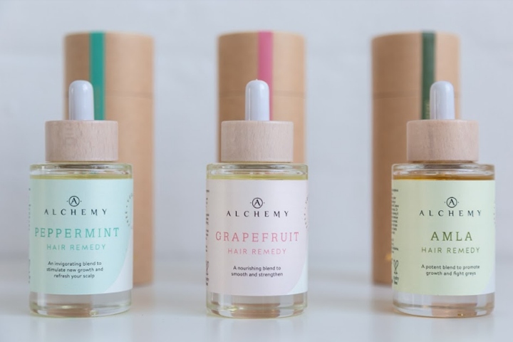

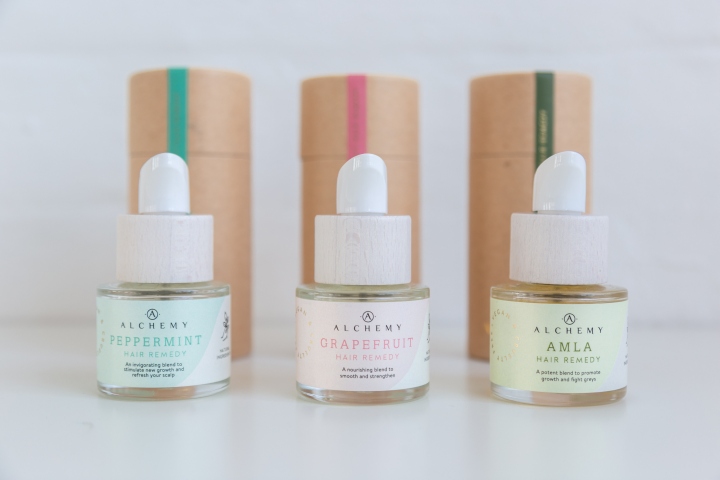
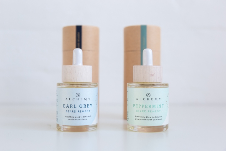
Global retail design agency Sheridan&Co reveals its latest work in refreshing the brand identity for Alchemy Oils – a specialist hair oil brand rooted in the ancient Ayurvedic practice of hair oiling from India, formulated using pure, nourishing and completely natural ingredients. The brand, which has won multiple awards and has an influential following, is a highly principled grooming product range that is fiercely proud of its paraben and cruelty-free vegan blends. Alchemy Oils promotes hair strength and growth with its therapeutically uplifting, deep conditioning treatments.
Alchemy Oils approached the strategy and design team at Sheridan&Co to work collaboratively in revising its look and feel as part of the brand’s wider growth strategy to target new stockists, update the bottle design to become more user friendly and appeal to new audiences, encouraging them to try out hair oiling for the first time. The objective was to explore a more luxurious visual direction that celebrated the brand’s Ayurvedic provenance, pure ingredients and promotion of self care rituals. More especially, the design solution needed to ensure that it resonated with both male and female consumers without alienating the nuances unique to the different tribes.
Michael Sheridan, chairman and founder of Sheridan&Co, commented: “Alchemy Oils appeals to a largely Millennial audience – their ideas of lifestyle and beauty are far from the pomposity, superficiality and excess of generations before them. The beauty industry is increasingly being influenced by activists fighting for more diverse representations of people from all cultural backgrounds and sexual persuasions. The acceptance of flaws and idiosyncrasies is becoming an empowering movement. Consumers have moved towards a culture of imperfection, vulnerability and diversity. This is reflected in the rise of messaging promoting ‘honest’ self-image. Alchemy Oils’ natural proposition fits well with this ethos; therefore the design solution needed to capture the zeitgeist and engage with an anti-perfectionist mentality of sorts.”
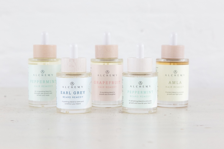
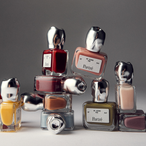
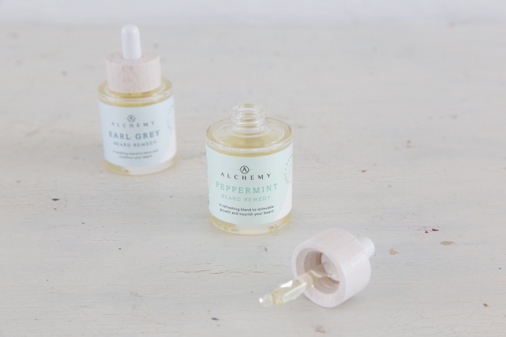
The logo, with its retained typeface, is overlaid on a pastel block colouring label using Alchemy Oils’ existing colour palette. For each product, two different shades are used – a soft pastel juxtaposed with a bolder, earthier tone to complement the typography and outer tube packaging labels. It’s Peta-certified, vegan and cruelty-free attributes are likewise delineated in a circular, stamp-like formation adjacent to the logo, giving the brand a powerful visual stamp of approval and drawing the eye to a key message.
Using the hand as a muse, the ultimate instrument for the Indian Ayurvedic practice of head massage, icons are used to denote the brand’s essential elements regarding purity of ingredients that strengthen hair and stimulate growth. Here, the brand’s wider attributes are communicated in a playful, succinct and visually compelling way. The outer plain cardboard packaging is given a premium feel with the gold foil Alchemy logo – a subtle nod to the precious honey-hued nectar encased within the apothecary-style bottle, while the block colouring label also seals the product and communicates the product’s key attributes.
Michael Sheridan added: “Alchemy Oils is all about purity of nature and taking the wellness practices of Ayurveda but making it relevant to a modern western audience. We have worked very closely with their team to create a visual brand identity that simply lets the honest beauty of the formulations shine through, while still making it a luxurious, indulgent and quite a special part of the daily self care ritual.”


Add to collection