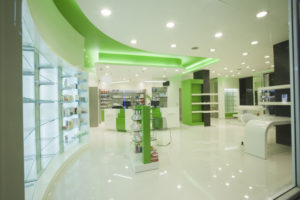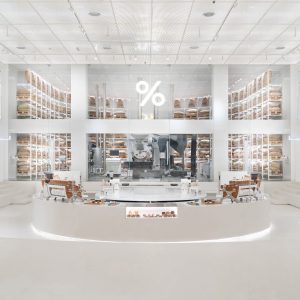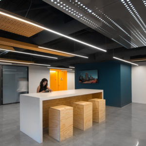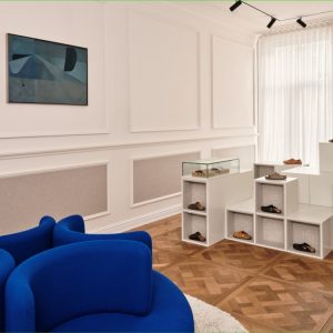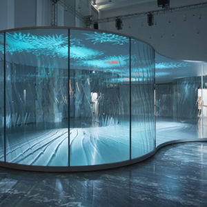


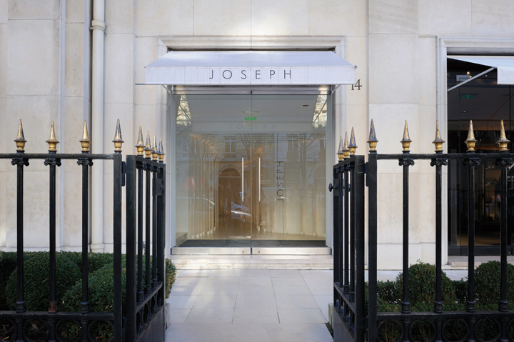
The existing architecture of the shop was itself guide of the project. The area is divided into three main zones: the entrance, the skylight area and the curved wall area. The access to the shop was a major problem since one had to go through the long hallway to reach the retail area. The main challenge was to do of this crossing an attractive path. The integration of the white metallic arches in the passageway gives it a rhythm and becomes unique architectural experience.
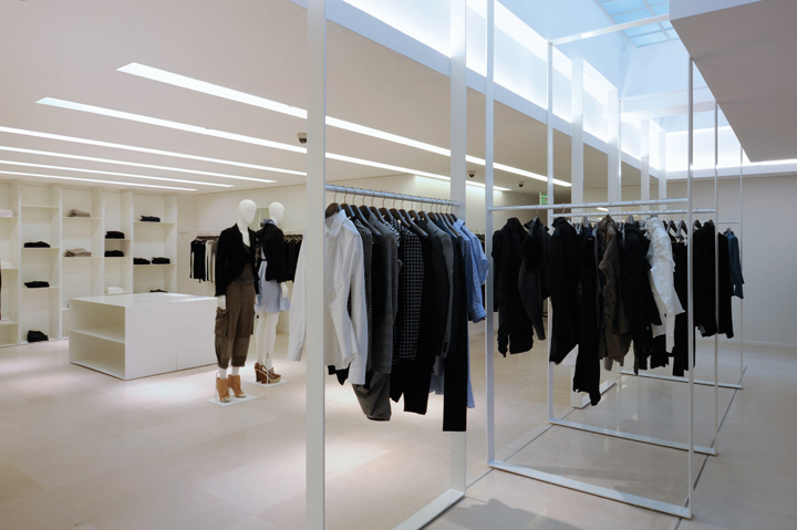
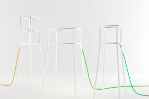
Once inside, the U shaped skylight could not be neglected and became also part of the design process. Metallic frames, 3,2 meters high, used as hangers, are suspended in the area, elevating the upper limit and giving a three dimensional impression into the space. Those frames can slide and turn all along the skylight and give so, the flexibility to design the space as desired.

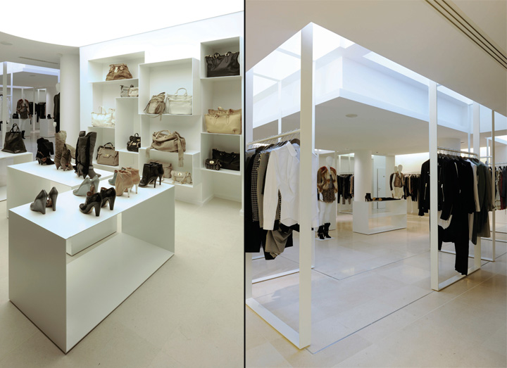
The existing curved wall was continued deep in the shop, creating a circular and welcoming space which is used as a lounge sitting, shoes section and changing rooms. This zone is the most lit in the shop with a backlit stretched ceiling and becomes another attraction zone. All the furniture and finishing in the shop is mostly in white except for the counter that is in black rough metal and is designed and worked as a sculptural piece extending out of the rest.
Designed by Raed Abillama Architects
Photographs by © Géraldine Bruneel





Add to collection
