Wyers bar restaurant by Studio Modijefsky, Amsterdam – Netherlands
posted by retail design blog on 2017-08-18
Amsterdam
Add to collection

A stone’s throw away from Amsterdam central station, the American hotel chain ‘The Kimpton Group’ settles in their first location abroad. In a completely renovated hotel, Studio Modijefsky has designed an all-day restaurant including a petite coffee corner.
After studying the historical context of the location, Studio Modijefsky created an identity and interior for the new restaurant and coffee corner. Previous to the hotel which was built in the 80’s, the corner of the Nieuwendijk and the Nieuwezijds Voorburgwal was occupied by the shop of a Dutch fabric firm, called ‘Firma Wyers’. This firm had their headquarters at this location for many years, and expanded their building and business from here before moving out to make way for a new hotel. The fabric industry was a strong starting point for the concept of the new restaurant.
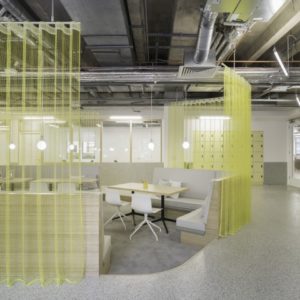
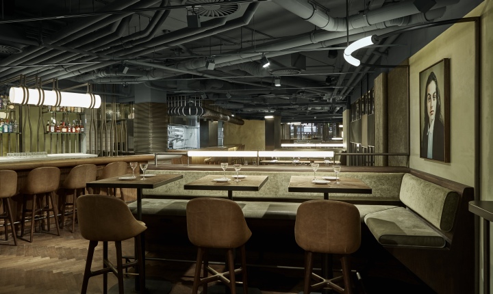
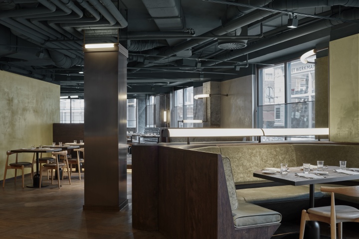
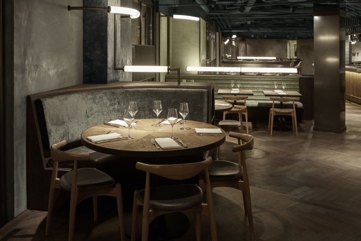
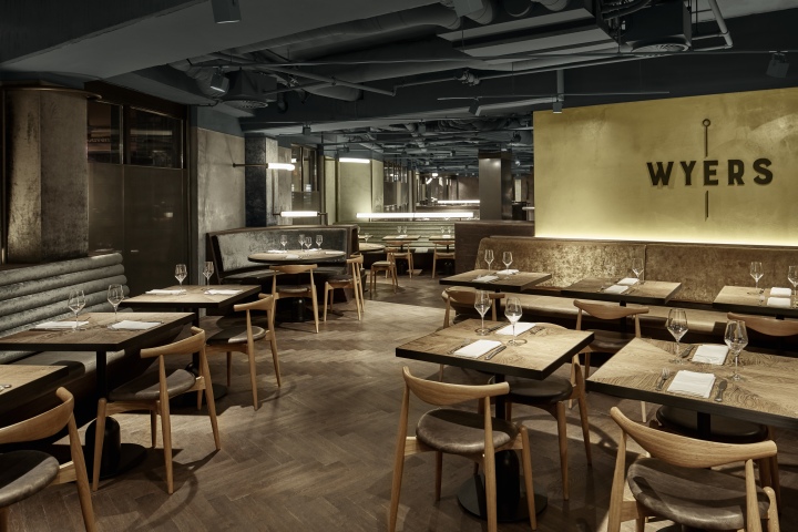
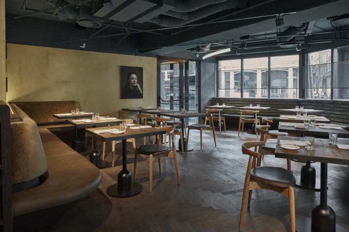
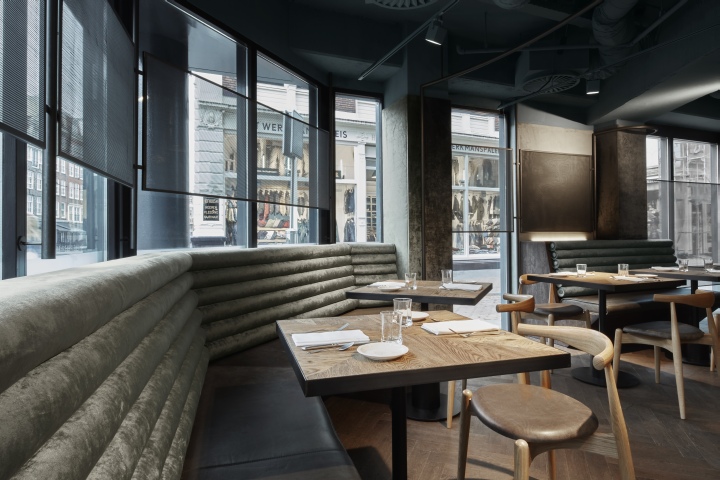
Analysing the space and its location, a new layout was made for the restaurant where the orientation of the building and outside traffic played an important role in the design. The restaurant space is located on the intersection of a busy pedestrian street and the main road leading tourists and locals from central station into the city. The design filters the surroundings and creates a softer environment away from this busy street. A subtle transition in materials, from hard to soft creates a calm atmosphere once in the restaurant. Steel and glass in the entrance lead to marble, wood, leather and textile finishes.
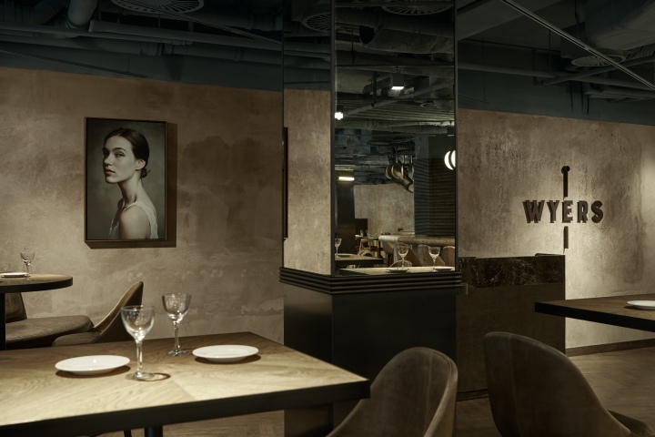
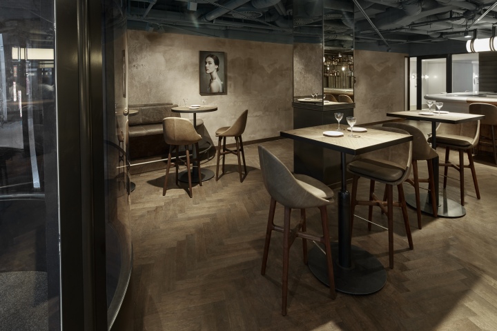
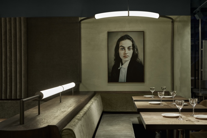
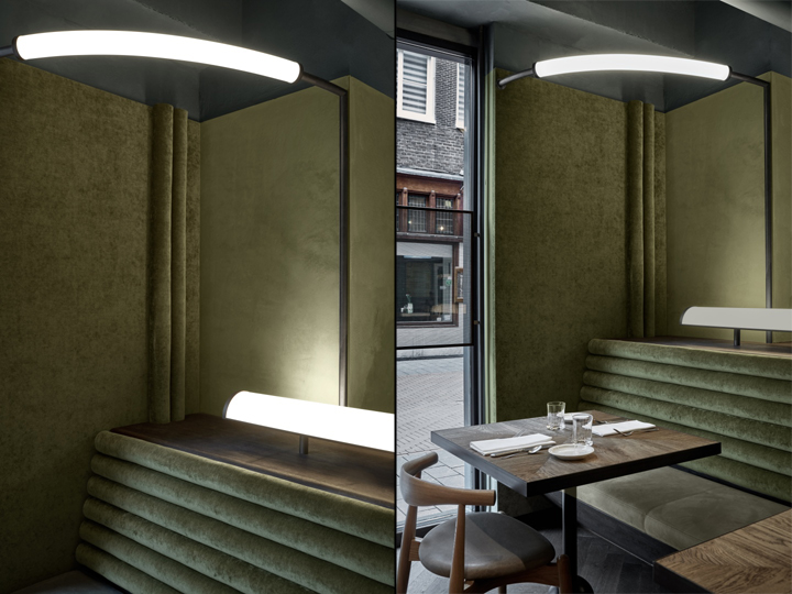
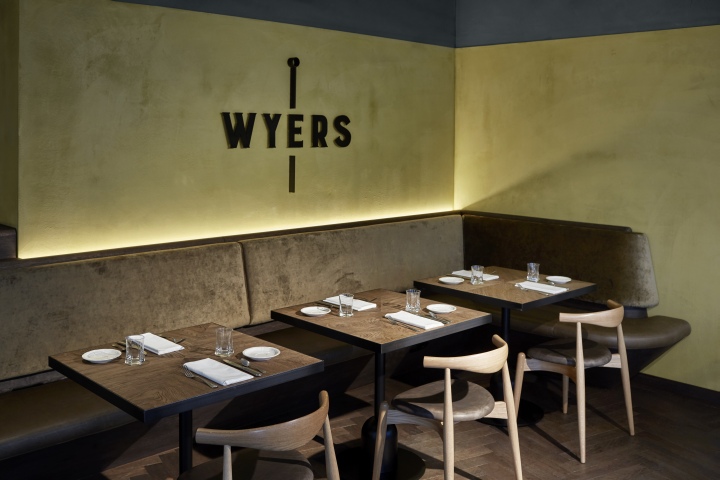
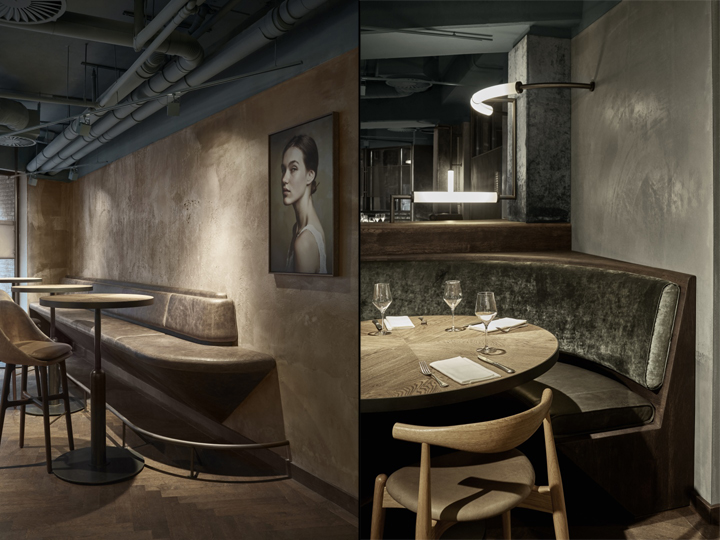
A rich colour palette complements the materials; olive green, elephant grey, clay colored brown and a warm ochre shift from one tone to the other, on the walls & furniture pieces. A weathered wall in clay coloured brown, with a leather bench in the same colour leaning against it is what welcomes guests into a warm and cozy space once entering. Moving further into the space olive green walls and banquettes grab one’s attention, covered in matching fabric and leather finishes. Followed by warm grey tones, used for window screens, fabric panels on the walls and curved banquettes, a playful and friendly touch soothes the space. A bright ochre color on a weathered plaster wall stands out next to the greys and greens. While creating an accent in the space, clearly visible from the street, the ochre wall holds the restaurant logo and a mysterious portrait of a young girl, shot by local Dutch photographer.
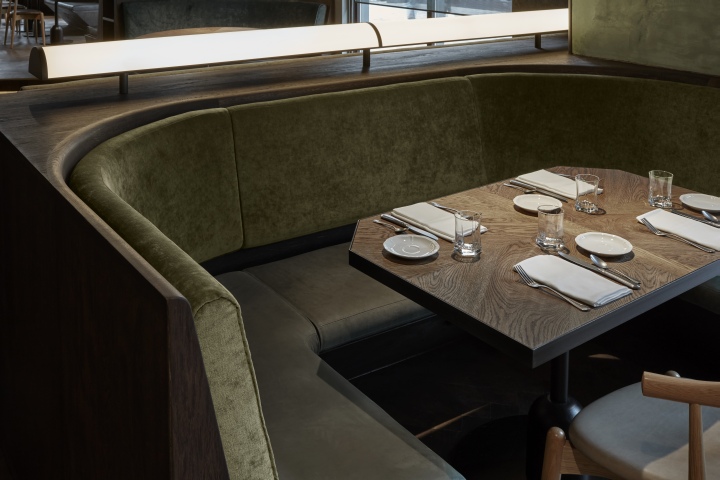
The design of the banquettes is a nod to the history of the site, the fabric shop. The back and seats of the banquettes resemble fabric rolls stacked in the shop, with delicate details, and in various colours and finishes, they represent the variety of fabrics that would have been on display in the fabric shop many years ago.
A metal tube lingers through the space like a thread weaving through a piece of fabric alongside the wall on the street side. Growing from the sculptural wooden banquettes, these spatial lines make playful curves and turn into a light tube before disappearing again into one of the walls between the windows.
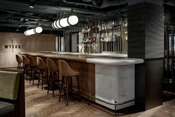
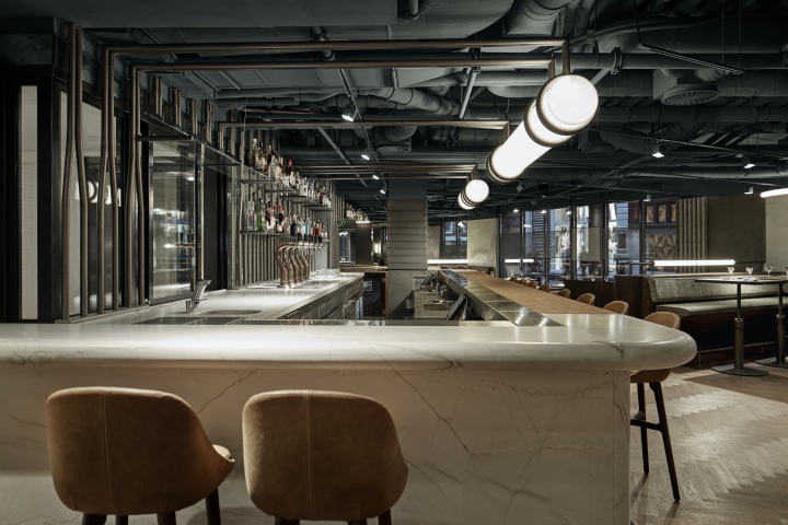
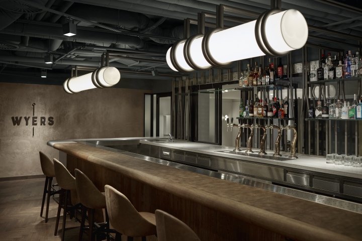
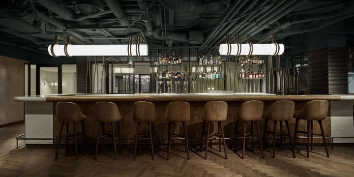
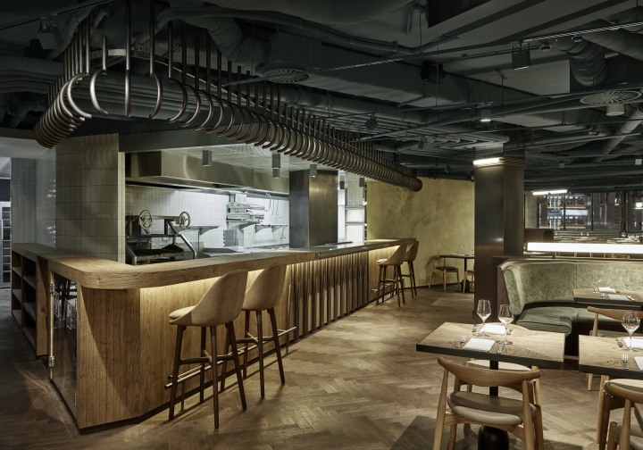
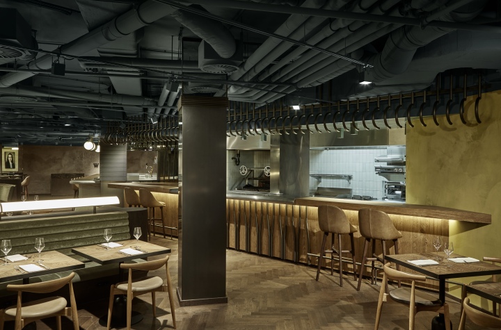
The bar and the show kitchen form two distinctive volumes in the space. The design of these elements takes inspiration from fabric production; big weaving machines with tons of threads coming from different bobbins overlapping and intersecting before turning into a piece of fabric. These visually exciting processes formed the base for the design of the bar.
Metal tubes decorate the back wall of the bar, and form the construction for the glass shelves holding the bottles displayed. These tubes, that refer to threads used in the weaving machines, go up all the way to the ceiling, and follow the ceiling to the front of the bar, where they drop down and wrap around a luminous textile roll. Some of these metal threads follow their way and wrap around the columns on the sides of the bar, giving an amusing and playful finish to them. The bar itself is a solid volume covered in end grain wood and off white honed marble. These sculptural objects with curved edges are designed to be very inviting to feel and experience.
The kitchen block invites guests to sit down and enjoy the visual entertainment of the chef preparing American food with a European twist. Watching food being made on open fire, with a background of locally produced handmade tiles, guests sit at a countertop made of wooden slats, and a stainless steel curved pass. Tubes hanging from the ceiling shine onto the show kitchen front, lighting up the food being served. These lamps are curved in the lower part as half circles to form a roll that wraps around the show kitchen.
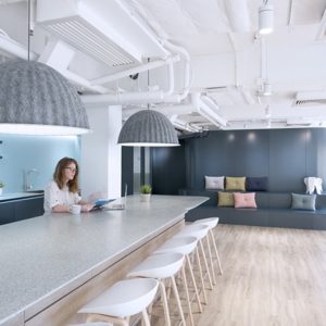
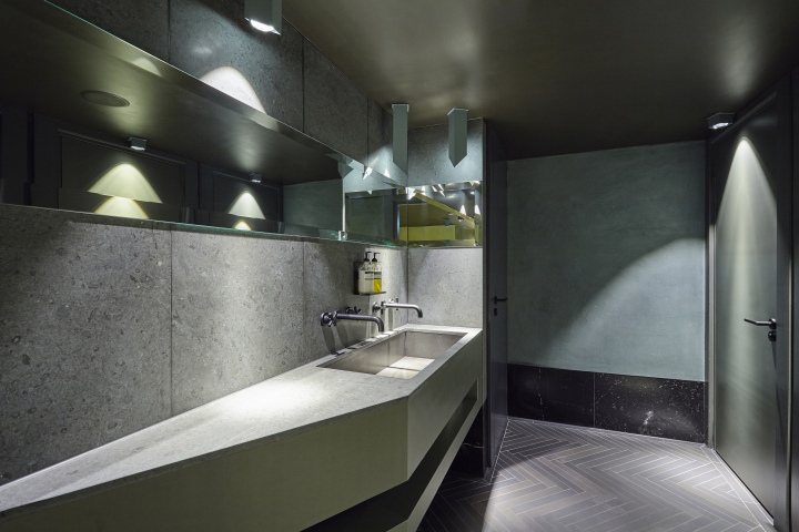
The interior is finished with a dark wooden floor laid in a weaving pattern, which continues down to a lower level where the bathrooms are situated. Here, dark blue tiles complement green plastered walls, and custom made light boxes hanging from the ceiling shine onto green marble sinks. Special details give this space its own identity, such as the toilet rolls placed in the back wall hanging like fabric rolls on the wall of a shop.
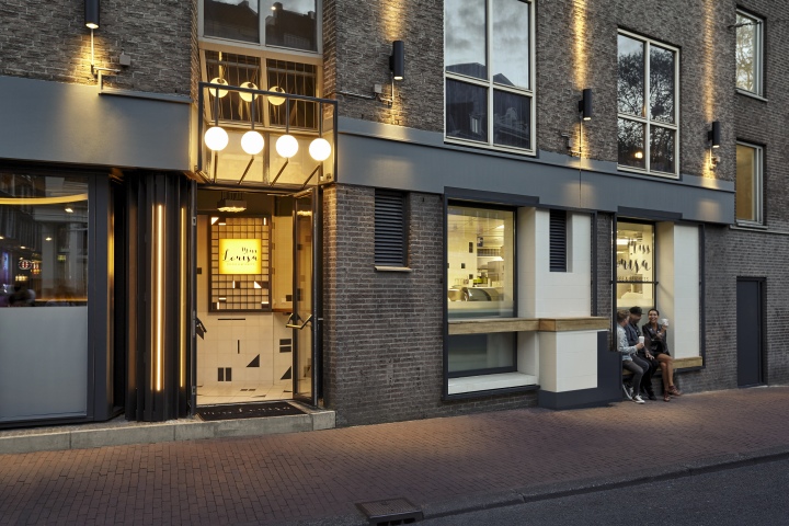
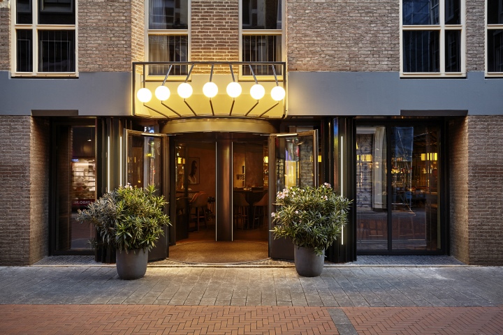
Entrances to the restaurant, both from the street and the hotel, give a sneak peak of the interior to the passerby. Several light bulbs highlight the entrance of the restaurant on the facade, where an extra-large Wyers logo made of steel hangs on the wall. A light box with a life size pin, an icon that marks the logo of the restaurant, highlights the entrance to the restaurant from the hotel.
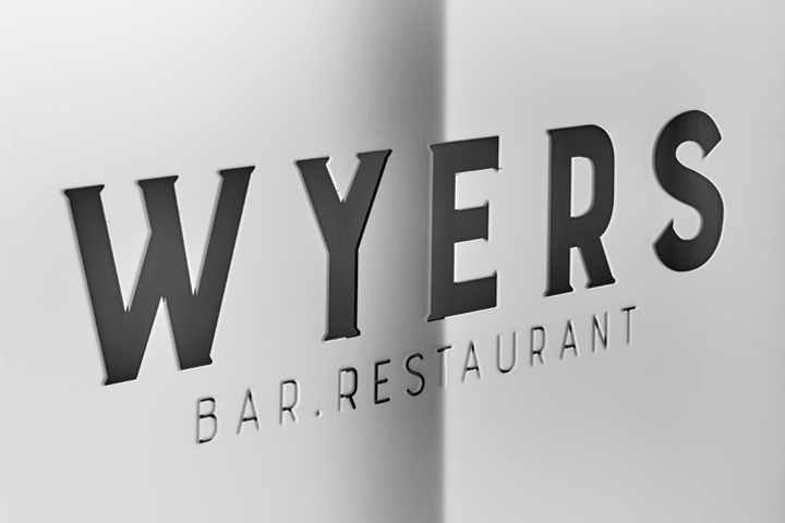
Strong block letters form the word Wyers in the logo designed by Studio Modijefsky. Complimented with a playful pin, referring to the fabric inspired interior, the logo can be pinned onto different elements such as staff uniforms, walls, facades and business cards.
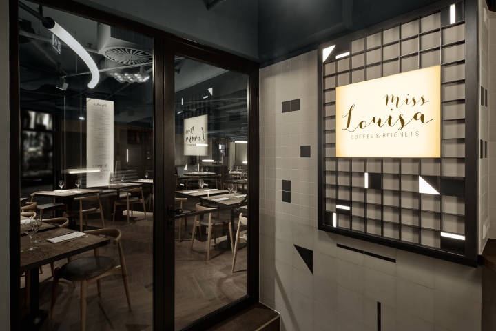
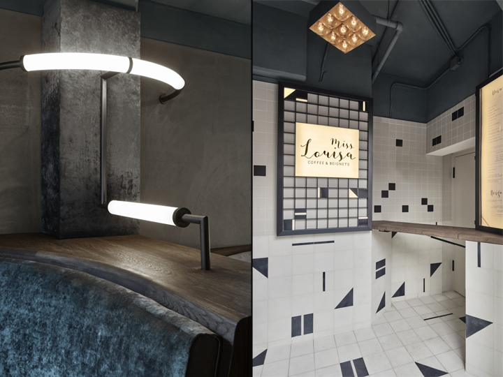
MISS LOUISA – COFFEE & BEIGNETS
J.P. Wyers, the founder of ‘Firma Wyers’ on which the restaurant design is based, was the father of 4 daughters. The little coffee shop on the side-street is named after the youngest daughter, Louisa.
Miss Louisa is a funny addition to the more serious restaurant space.
The space has a strong graphic appearance. Facing the street, which historically hosted many newspaper offices, the design of this corner is a subtle ode to this history.
A bright corner stands out from its surroundings and attracts the crowd passing by. Using a variation of black and white tiles, combined with a steel light box and steel frames on the brick facade, Miss Louisa feels like a funky fresh vitrine to step into and order a cup of coffee with a freshly baked beignet.


Add to collection